Web dashboard on AWS monitoring engagement with politicians' tweets
This project involved creating a Shiny app that automatically fetched the latest tweets from 150 politicians who drafted the 2022 Chilean constitution proposal. The app displays interactive visualizations based on the tweet data, focusing on measuring the engagement (likes and retweets) that the politicians’ tweets receive. It also allows users to read the most engaged tweets without leaving the app.
(Please note that due to AWS cost considerations, the application is currently inactive. The code can still be explored through the links below.).
How it works
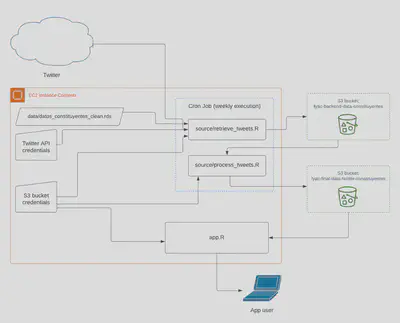
I use rtweet, an R wrapper for the Twitter API, to retrieve data. The data is then processed through a data pipeline written in R and exported to an S3 bucket in .rds format. This process is automated to run once a week using a Cron Job on an EC2 instance.
The same EC2 instance hosts the app.R script, which is the actual Shiny web app. The app is connected to the S3 bucket containing the data pipeline output. It retrieves data from the bucket when changes are detected.
How to use it
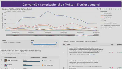
The user interface of the app consists in the following visualizations:
-
A
plotlyline-plot on the top that displays the trends in total engagement by political coalition. It shows data since the beginning of the drafting of the constitution proposal. -
A
reactableon the bottom-left showing a descending ranking of politicians based on the engagement they got on Twitter during the last week. This table supports instant search by Twitter handle or political coalition name and allows filtering based on demographic features of the constituents (age and gender). -
Another
reactableon the bottom-right that displays a ranking of the tweets themselves, sorted by total engagement. It also shows the number of Likes and Retweets and allows sorting by one of these instead of total engagement (the sum of the two).
The visualizations are linked to each other through Shiny’s reactive programming, allowing you to filter some of them by selecting elements in another one. The supported reactive interactions are the following:
-
You can click on one (or several) coalition(s) on the legend of the top plot and the
reactables at the bottom will be updated to only show data from the selected coalitions. -
You can select specific constituents on the
reactableon the bottom-left and the ranking of tweets on the right gets updated to only show tweets from the selected constituents.
Code
These GitHub repositories contain more technical details about the inner working of the app along with instructions about how to get it running in a new environment from scratch: