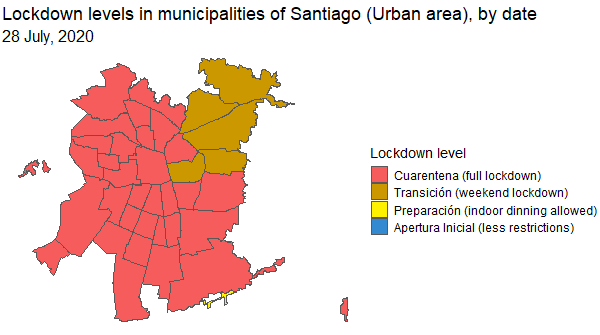
A map created with gganimate showing how COVID restrictions and lockdown severity evolved in Santiago (Chile) since the outbreak of the COVID-19 pandemic.
The data was retrieved from the official COVID data repository of the Chilean government, while the geographic layout (geometries) comes from the sinimr R package.
Each frame of the animated plot represents a day, and the colours represent the levels of the four-tier restriction system implemented in Chile between 2020 and 2022 as a response to the pandemic.